Character Spotlight on Siona and Insight on Character Design
I'm here with our first character spotlight covering Siona Rufus. She is the main heroine of Zeta Wolf Chronicles, and due to the fact that she isn't seen much, there is a lot of mystery surrounding her.
First, I wanted to thank those who opted to follow our Kickstarter campaign! Remember that our next demo will release on February 14th, 2023, and that our Kickstarter will launch on February 28th. The time is nearly upon us! I can confidently say that the demo is 95% complete on my end.
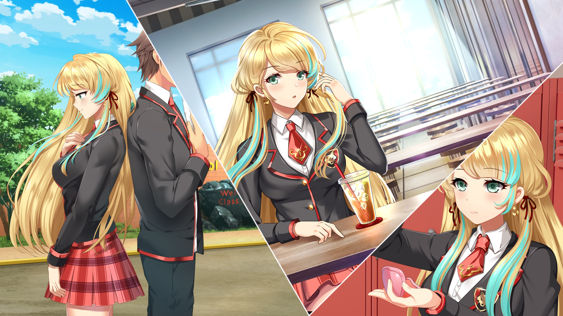
Back to our heroine at hand, Siona Rufus. Let's start with the basics regarding my inspiration for this character. Siona is a rather uncommon name, something I wanted. Let's be frank, people can get easily confused as to what character they are talking about when you have simple names like Bob and Sarah. See the Final Fantasy series with Cloud and Sephiroth, a series I believe has thrived on unique names. The closest comparison I can think of is Sion from the Sword Art Online series, a character I know little about since I only watched the first season. It's a common trend of mine to take a name and add an extra letter (typically "a" in the case of females) to make something unique. I believe that's how I adopted Siona as her name-it was unique and also sounded pleasing to me.
Little known fact here, many of the girls in Zeta Wolf have last names inspired by species of wolves. In this case, Rufus as her last name is inspired by the "rufus" species of wolves referring to red wolves. I believe there is not much reasoning as to why I chose "red wolf" specifically, but I just wanted a name that flowed together with "Siona". Although she doesn't have red hair, Renden High colors are red and black, so there is some background inspiration for that choice.
Main Design and Aesthetics Inspirations
When I started the development of Zeta Wolf Chronicles, I had no idea what I actually wanted my characters to look like. The integral design choice that I insisted on was something derivative of the typical anime style. The reason is, mostly personal bias here, but with most of my favorite media consisting of such works, I held the belief that it was the most attractive style at the time.
I scoured the internet looking for some form of inspiration. Googling and looking for attractive images usually is a good starting point. In my case, I happened to find a source of inspiration by randomly scrolling through manga. As it turns out, Siona is heavily based on the design of Akane Minagawa from Scum's Wish/Kuzu no Honkai. At the time of using Akane's design as a base reference, I simply chose it because I was a fan of her aesthetics in general (without knowing much about the source material).
For the main heroine of Zeta Wolf, my main objective was to design something attractive - the spitting image of a nice, cheerful girl, yet easily misunderstood. I suppose this is what you could call someone who is "conventionally attractive". From this reference image, I only had the basic attributes - facial structure, hair styling, proportions, and so on. Siona would be close to a cookie-cutter clone if we lived in a world with just black and white.

Akane Minagawa, as it turns out, is not a blonde, or a student, nor does she have the same eye color, bust size, and other attributes. I would later learn what she actually looked like after the fact (in 2022 as of writing this post).
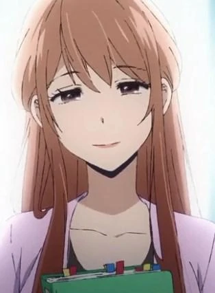
The main observation to take from here is that Akane's manga design allowed me a suitable foundation to build from and to alter and customize as I saw fit. I was not at all influenced by her colorized aesthetics, as I never used that as a reference. I should note that I am NOT an artist, but just like probably all game designers, I prefer to design appealing characters with some thought and effort spent toward their design.
Siona's Design Blueprint/Reference Sheet
As a designer who cannot draw, it's important to elicit the help of and employ a talented artist with the design style you are looking for. It's also imperative that the artist has a reliable work history and won't ghost you. Having been in development for over four years, I am quite fortunate that I was always able to maintain communication with my main artist. After selecting to work with them, and with my references in hand, somehow I arrived at Siona's finished design. Let's walk through the steps and my notes on how I got there.
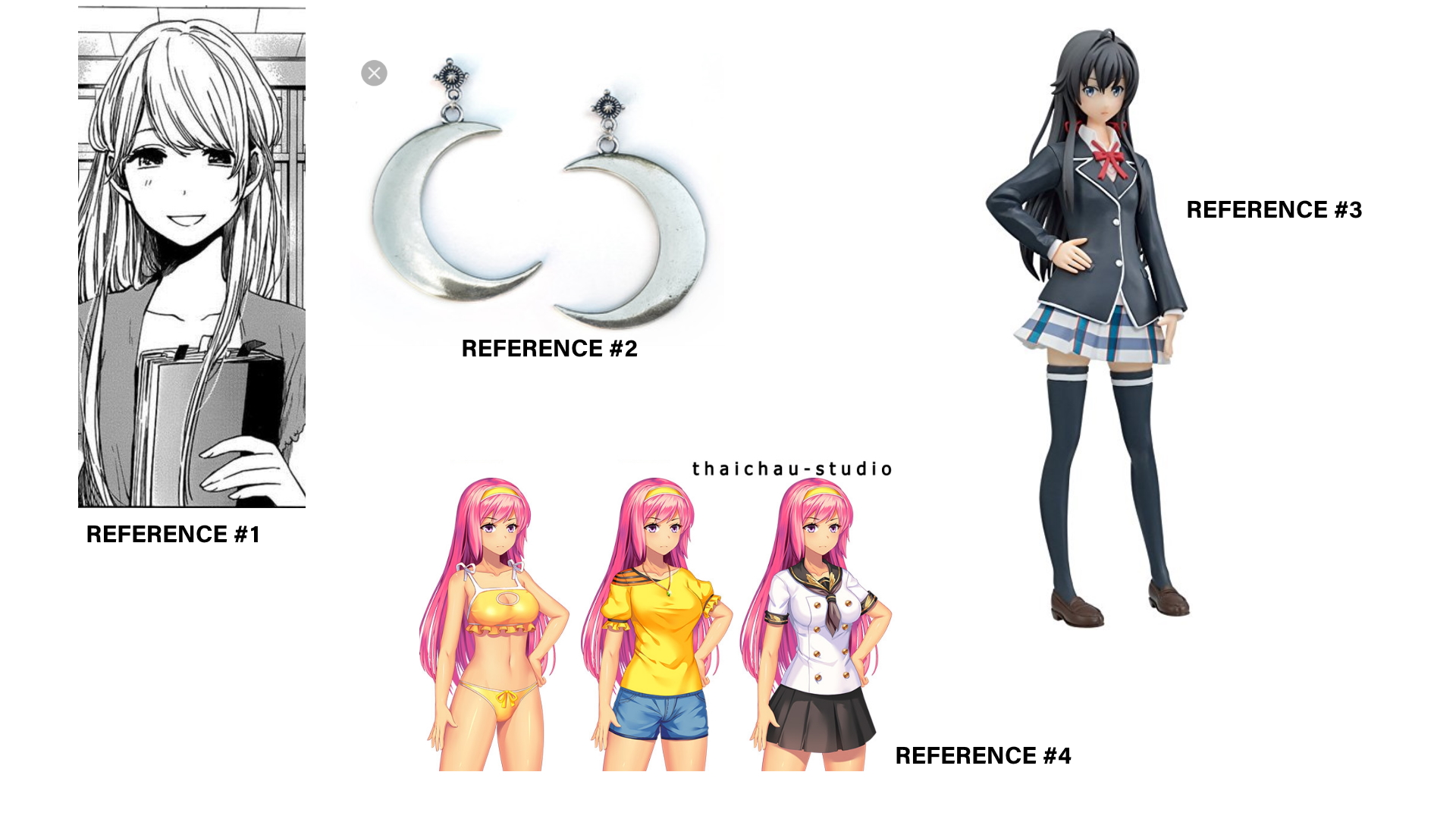
Basically, I constructed a reference sheet, along with a detailed write-up as to how I generally wanted Siona to look. The more in-depth and thorough you can be in your explanations and references, the better. Usually, for visual novels, you can get away with just constructing the 2D-based sprite without a need for a 3D character sheet, which is typically more costly. This is typically the character t-posed (arms spread out) and sketched from different angles which is useful for modeling/drawing in 3D.
First, some general specifications on the sprite. I asked for the following:
- Female: 18 y/o
- Style: Soft-Shaded Sprite
- School Uniform
- Expressions: neutral (soft), neutral (wary), smug/flirty, and smiling
I asked for 18 years of age specifically to avoid young-looking characters, which is rather arbitrary and up for debate, but there are reasons for this. From following the visual novel development scene for so long, I have become aware of certain trends and hot topics. One of the biggest issues is Steam's unfair and unequal treatment when it comes to visual novel bans on their marketplace. I do hope to launch on Steam one day, and it is my biggest fear to be given the ban hammer after such a long time in development. Despite the circumstances surrounding Steam and publishing certain visual novels there, I still wanted to proceed with a high school environment.
A soft-shaded sprite style is a particular coloring style that I chose from my artist. Usually, in their portfolios and commission information, artists will specify the exact details regarding work, and in this case, it is the style that matched closest with my vision for the characters. This is shown by reference #4 in the graphic above, which is a sample of my artist's previous work. School uniform mention is the default costume of the character, which I also had to detail and outline in my notes. Expressions are simply specifications for the characters starting expressions, and many artists bundle together several with the purchase of a sprite.
Next, comes the actual write-up of the design specifications I was looking for. This is an exact verbatim quote from what I sent my artist four years ago.
Large enough for 1920×1080 project. I'd take some inspirations from attachment #1, namely soft facial features, body shape, etc. Hair texture/styling/bangs can be similar. Hair length would reach down to the bottom of the sprite frame (down to lower thigh/kneecaps). One strand/highlight of hair/bang would be a different color then the rest of the hair. I would like 2 strands of hair to fall down her chest like the attachment #1. Right side of ear covered by hair. Left side of ear (meaning right side from viewer's perspective) she'll have a red half moon (crescent) earring similar to attachment #2 but with a red moon and a gold chain.
If we look at the next attachment #3, I'll provide the outfit reference. This custom outfit will be worn by the female characters in the school (uniform). Black main color (top) with red trim instead of white, and white undershirt similar to the attachment. Instead of a bow she will have a red school uniform tie that is short and doesn't run past her chest. Her uniform undershirt will be revealed (top buttons off) with a partial glimpse of cleavage (tie still hangs loosely over). Red skirt with black patterns.
If we reference your artwork, attachment #4, I'm liking many attributes here, but skin color is several shades lighter (not pale), height is comparable as well. Chest/Bust size "slightly" larger.
I like the idea of a wolf's head emblem or insignia somewhere on the chest of the uniform. This would be the logo for the school the characters go to. Preferably in red against the black uniform background. The game has a lot of wolf motifs, so I feel this would give the outfit a unique design.
Colors notably eye color and hair color can be revealed after the sketch phase. However her main hair color will be a lighter shade.
Feel free to give some unique variations based on the outline above to create a visually appealing design.
From here, I'd like to nitpick and dissect some of the decisions I made. Most artists usually draw in 1080p minimum, but I thought I'd specify this since it was my first commissioned work from them. They actually draw in around 2.5k to 3k HD, which is helpful when using the assets in promotions and such. Unnecessary for the game itself, as all assets are 1080p, but the more the better. From the first paragraph, I went into further detail specifying facial design, hair length, texture, style, and positioning. Hair design, in my opinion, is immensely important for anime-styled characters, which is one reason I tried to give her as many unique attributes as possible. Lastly, I mentioned her earring accessory, which ties into the wolf and moon motif that is present in many characters in Zeta Wolf.
Paragraphs two and three simply detail notes on what I personally wanted for the character and what I thought would be appealing. You might notice some of my design preferences when you survey the entire cast. At this stage of the commission, I didn't actually know what colors I wanted for Siona, but that doesn't seem to be a problem until after the sketch. Lastly, I made the comment about the artist using their intuition to create an appealing design. After all, they have the pen in hand and the experience of drawing characters. They'll likely know more about design aesthetics, and make small changes that result in a more polished product. As we move to the sketch phase, you'll notice several modifications (or omissions) that my artist made to my requests.
Sketch Phase
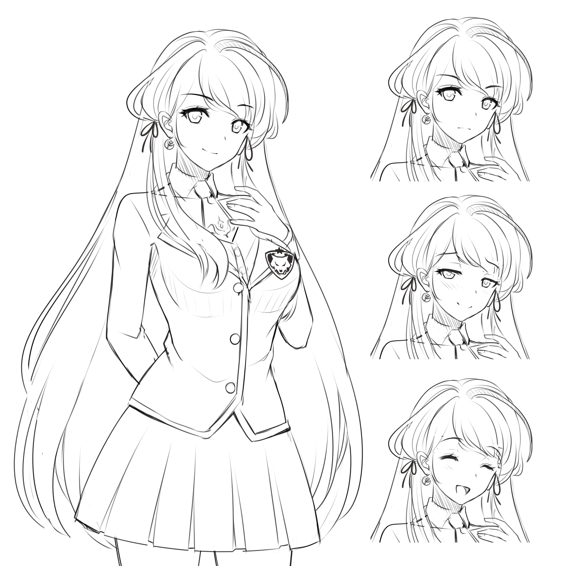
Waiting for assets to be delivered is usually one of the most agonizing parts of game development. Depending on an artist's motivation and workload, it can take several days to around a month to move on to the next phase. Well, when the sketch came back in full, I was largely impressed with the results. Each of my specifications was seamlessly integrated, and the art style seemed to be on point. I did notice a "small" omission, that was likely changed by the artist during the sketch phase.
Her uniform undershirt will be revealed (top buttons off) with a partial glimpse of cleavage (tie still hangs loosely over).
Turns out, she looked fine as it was, so I decided not to press the artist about these particular details. It was simply a stylistic choice that may not have worked with the outfit or design choice I specified. Usually, unless it is something I really wanted to implement, or a huge glaring omission or flaw present, I tend to let the artist do their thing (trust builds up after a long working relationship). As such, most of the female designs typically have them in "proper" uniforms, though there is one main character (Crescia) with that additional fanservice, due to her particular story beats. It's worth noting that the artist also added detailing regarding her hairbands/ties (adjacent to her ears) which was another inclusion from my base design.
Since the sketch turned out well, it was time to provide additional details regarding her coloring, which I happened to omit in the previous step. As before, here's a verbatim quote regarding the direction I was looking for.
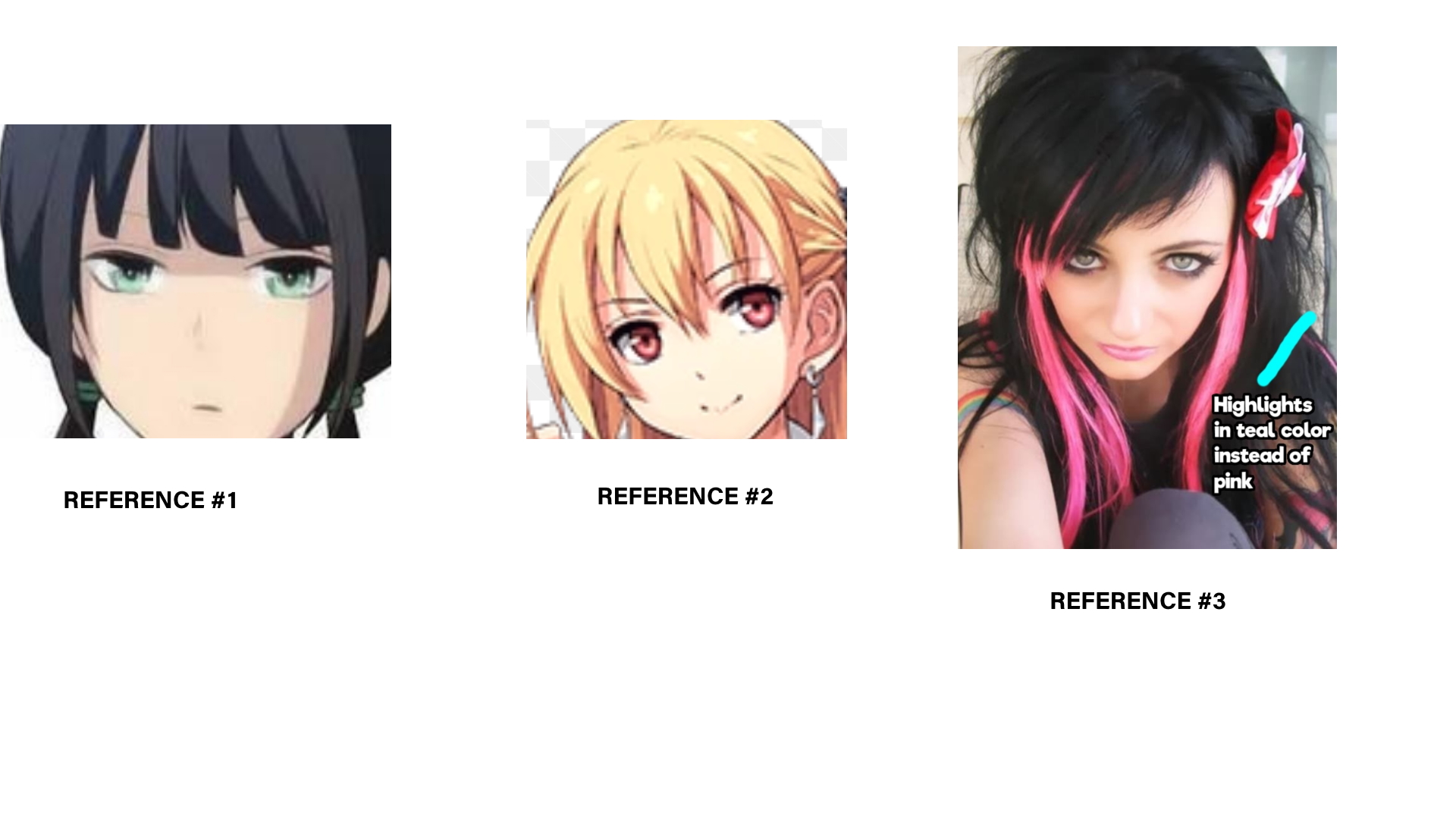
Eye Color: Similar color and hue to reference #1
Skin Color: Similar to reference #1
Hair color (Main): Blonde, similar to reference # 2
Highlight Hair Color: Refer to reference #3 except the highlight color is a bright teal/turquoise color. The placement might be difficult on the sprite for this highlight coloring, but how about on the strand of hair that visibly falls across her chest? It might take some adjustments to get an appealing result.
For these coloring choices, I drew inspiration from many of the media I was into at the time, that exhibited a similar art style. You might recognize Alisa from LOH: Trails of Cold Steel, which I used here, and the main heroine from RE: Life as inspiration for her eye color. For the positioning of her highlights, I needed a reference, so I did some Google searching for that one. I obtained reference 3 by searching for hair highlights on actual real-life girls. Why a highlight/dual color hair color you ask? I felt like I wanted to incorporate unique shading for her hair to give her additional unique attributes, and also to pay homage to my origins. AniClash Studios is named after my old community on Twitch where I worked within the anime fighting game community hosting online tournaments, often with real cash prizes. It was a special, memorable period of my life, and I wanted to pay homage to it with my studio's name, and also special easter eggs such as this. I have noticed that it seems to be a common trait nowadays for character designs to have multicolored hair (see Genshin Impact and Fire Emblem), but when oversaturated, it can look tacky in my opinion. That being said, it is a trait I incorporated in 5/11 of my character designs so far to date.
Onto the next phase, a color sketch. This is something your artist may or may not skip, depending on your familiarity with them and their commission process.
Color Sketch
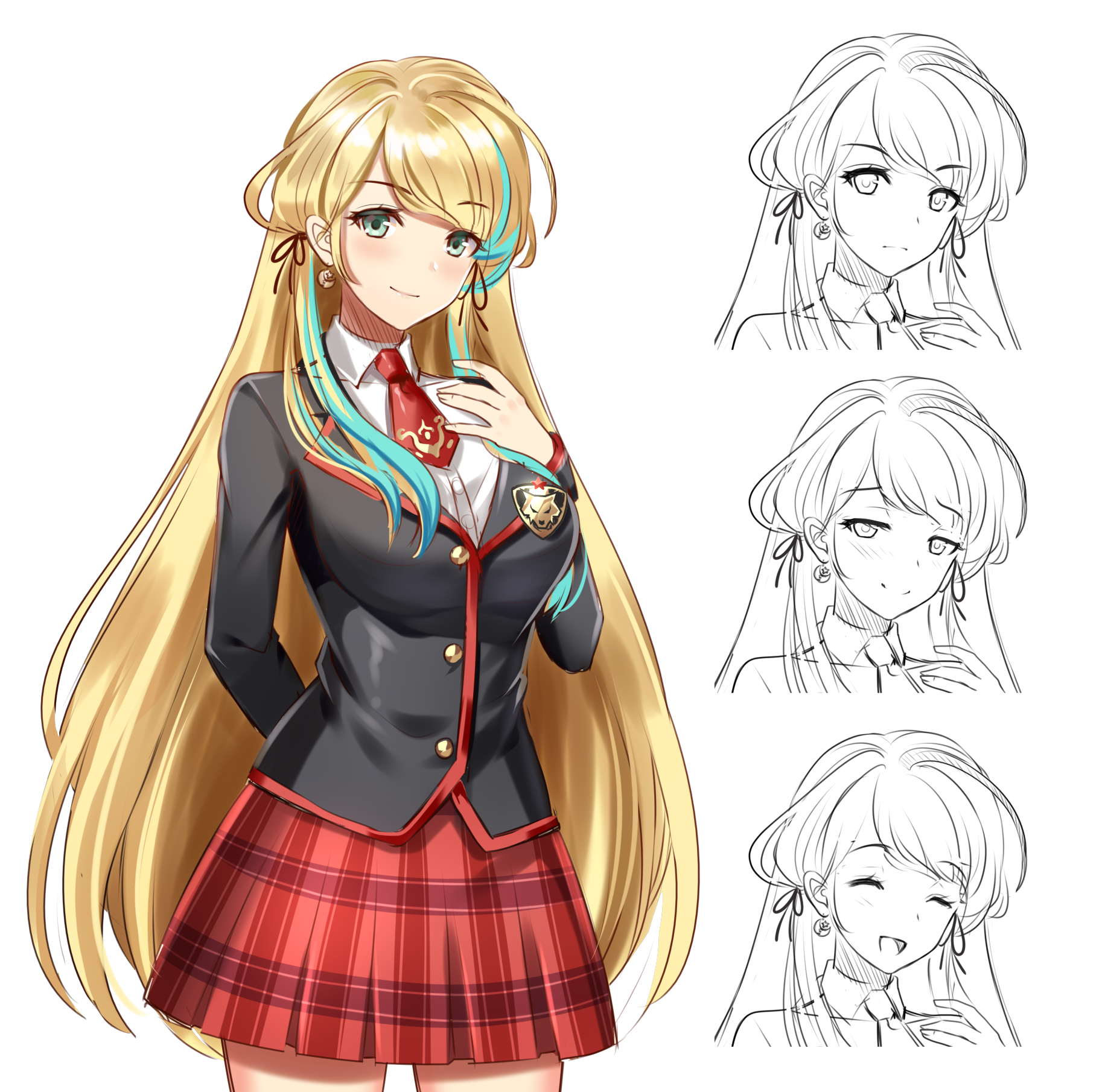
Analyzing this picture, you may notice a few things here and there that differ from my original visions and references listed above. There are subtle changes, but I believe personally, as the designer, you have to make a compromise between yourself and the artist to create the final product. For the most part, these were characters I created to satisfy my perceived whims of what I thought looked good. Ultimately, though, it's the player's input that matters most when they actually play your game. Since I was a new studio with no way to receive such input, I went with my artist's general style and preferences. If you're starting out with your own personal character designs, or as an artist, I recommend r/VNdevs.
Final Sprite Design
After much delay and anticipation, our final colored design arrives. There wasn't much for me to do but admire how she turned out since I was mostly content with how things turned out in the previous step.
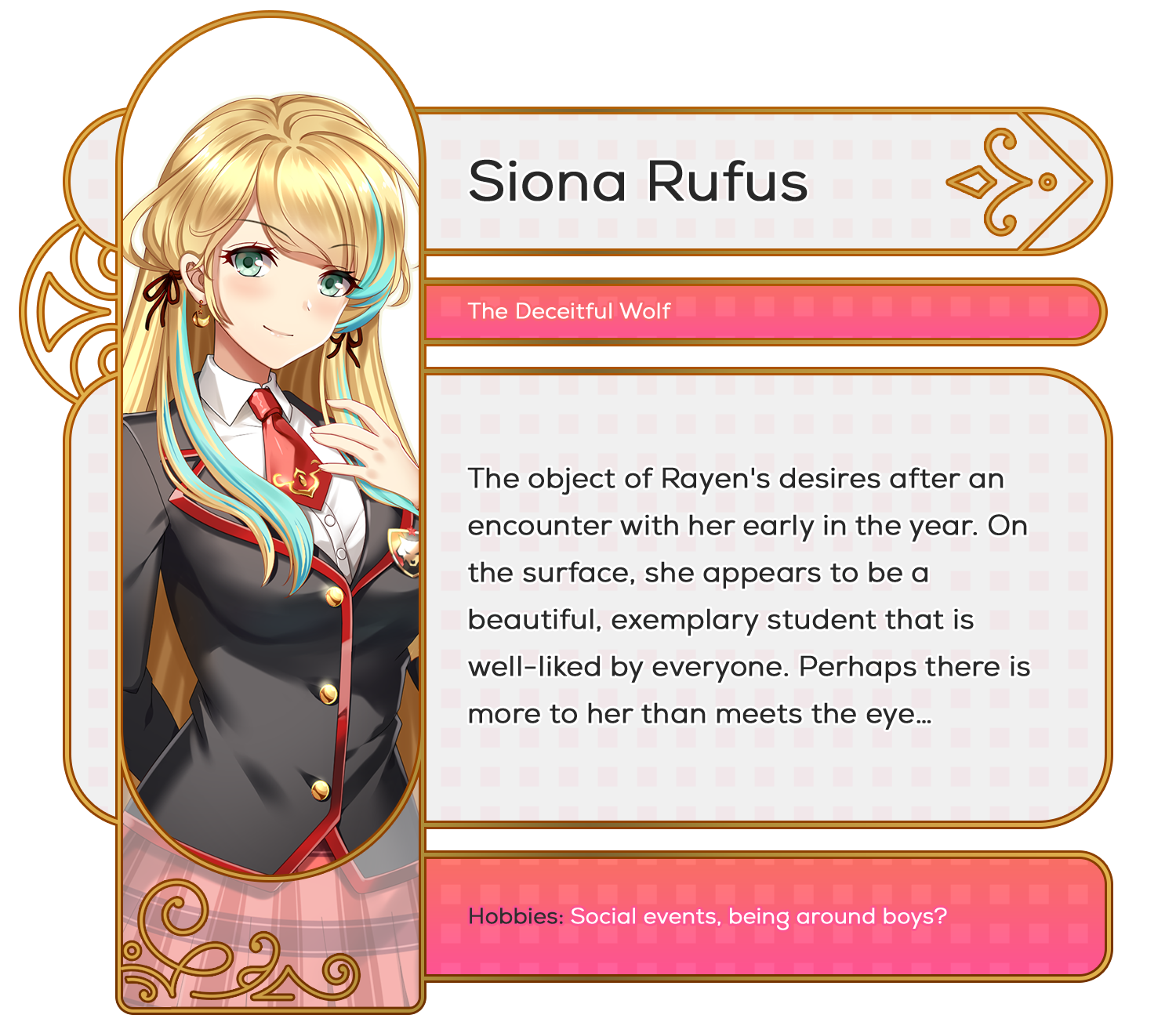
So there you have it everyone, my general workflow for designing characters and working with the artist to achieve the final result. The main thing to keep in mind is that you can never be too elaborate with your notes and descriptions for the design blueprints. In fact, the more detailed the better.
Even though Siona is rarely seen in the game, I have a few screenshots from upcoming content. These occur during the unlockable scene of Chapter 3. Who is Siona talking to? Will our protagonist find love in the end? Play our demo (when it's out) to discover the truths behind all these mysteries and more!
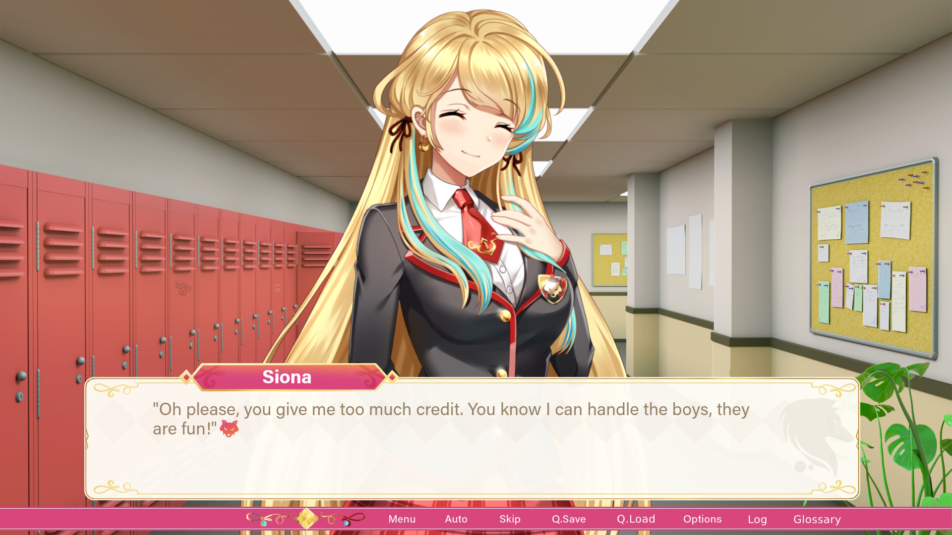
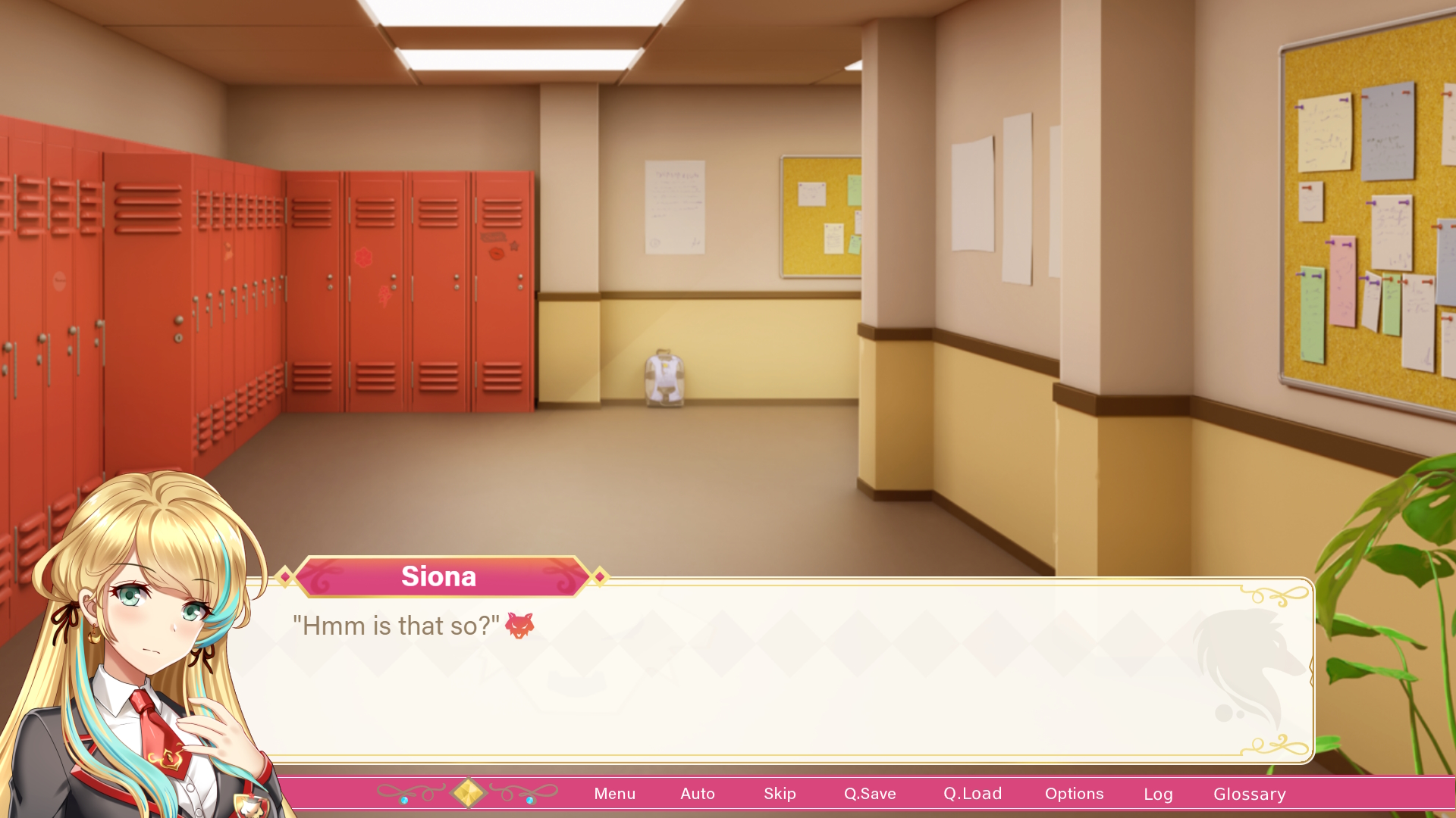
Thank you, everyone! February will be a busy month, indeed. My next post will coincide with the launch of our demo, so please look forward to it.
Get Zeta Wolf Chronicles
Zeta Wolf Chronicles
"Date" one of four girls on the path to enlightenment. Prom awaits. Will you be led astray by an old crush?
| Status | In development |
| Author | AniClashStudios |
| Genre | Visual Novel, Educational |
| Tags | Anime, Coming Of Age, Dating Sim, Life Simulation, Multiple Endings, relationship, Romance, Slice Of Life |
| Languages | English |
More posts
- Preorder Store Closes 9/29! Merch and Beta Info!Sep 18, 2023
- Fully Funded on Kickstarter! < 48 Hours Remain!Mar 30, 2023
- We are 77% Funded on Kickstarter! 9 Days left!Mar 22, 2023
- Our Kickstarter Campaign is live!Mar 03, 2023
- Kickstarter Launches Today! Giveaway + Livestream InfoFeb 28, 2023
- Update 3.1 - Major Bug Fixes!Feb 18, 2023
- Version 3.0 Available Now!Feb 14, 2023
- Kickstarter and Demo Launch Dates Revealed!Jan 06, 2023
- It's Crunch Time! (Dec Devlog)Dec 06, 2022
Leave a comment
Log in with itch.io to leave a comment.